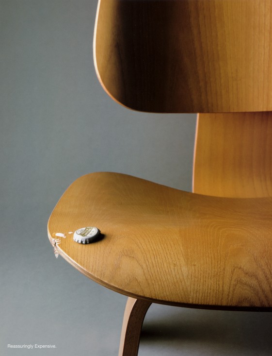
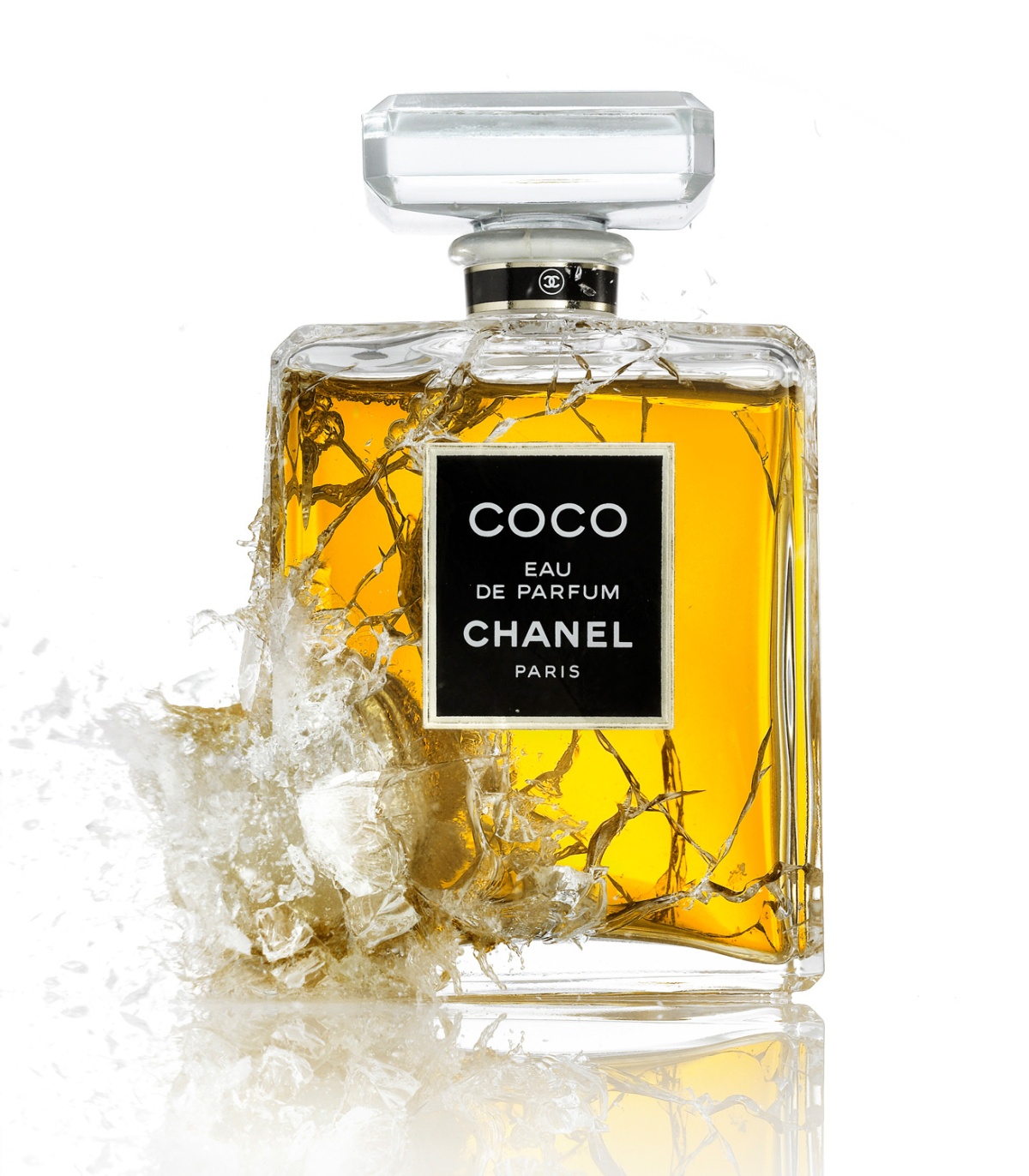
Adrian & Gidi is made up of the collaborative duo, Adrian Woods and Gidi van Maarseveen, who have known each other since their student days in the Royal Academy of Arts in The Hague. Based in Netherlands, Amsterdam, this photography duo is very creative in their pursuit of “tangible still life and product photography and favour a playful and experimental approach towards work.” Their set designs and props used are quite elaborate and the materials they use can include paper art, paper craft, styrofoam, plexiglas, miniatures and wood. Even with their focus on set design and animation, they never lose sight of the message they want to communicate with their visually graphic photographs.

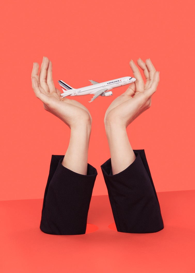

In this series for Air France, Adrian and Gidi uses the various props to evoke the feelings of a smooth, comfortable yet luxurious ride with the Air France airline. With just a silk sheet blowing in the air or a pair of hands cradling the plane, the concept behind the art direction is well-rounded and sophisticated. They didn’t see the need to photograph model air stewardesses in the interiors of airplanes, they simply used some handicraft materials and ingenuity to bring forth the message that Air France is your next airline to book.
To view the full set of images for this campaign, you can visit this.
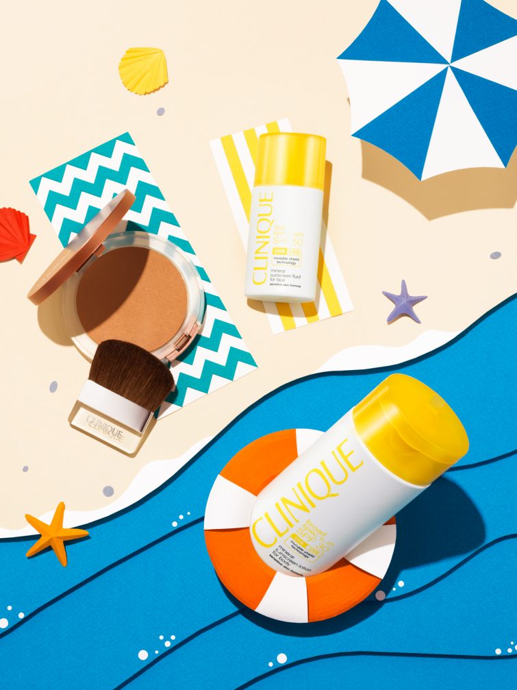
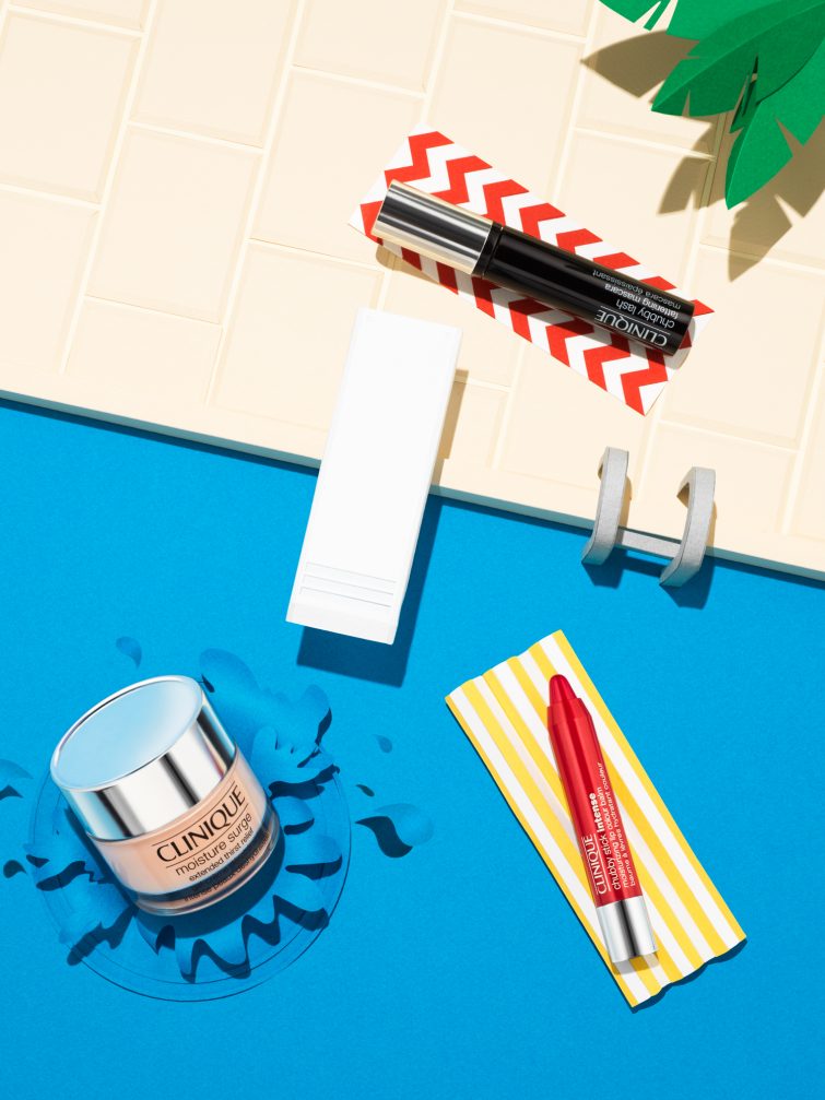
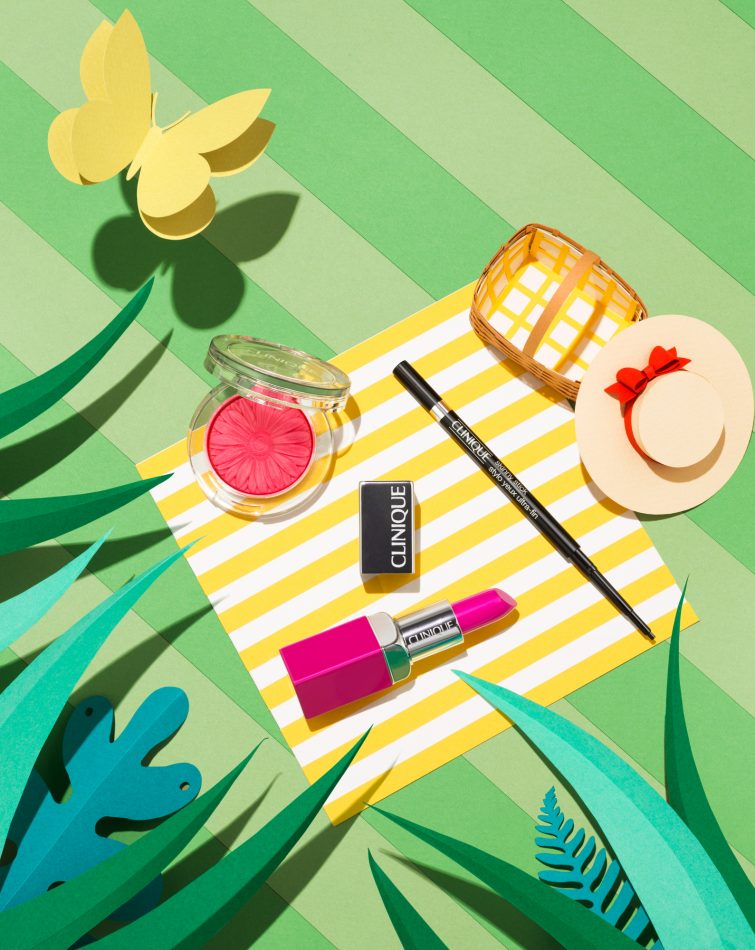
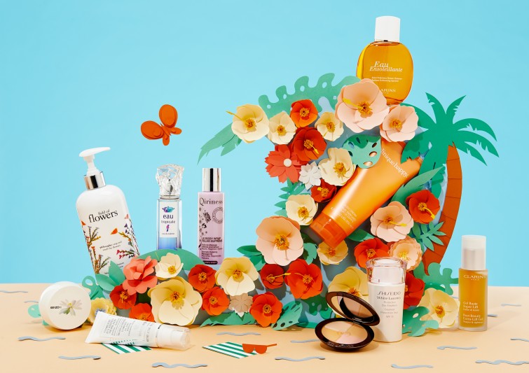
For Clinique, Adrian & Gidi have personified the cosmetic products and placed them in different summer settings which would be familiar to their targeted audiences – sunbathing by the beach and pool, relaxing in the garden with a picnic. These set designs are more detailed in their handicraft and brings a 3-dimensional effect to the images. Even the nitty-gritty details in the water waves and splashes are not ignored by the duo. The overall theme of summer is very strongly brought out by the colours and imagery used and helps achieve the branding message that Clinique is the summer cosmetic brand to purchase and own.
To view the full set of images for this campaign, you can visit this.
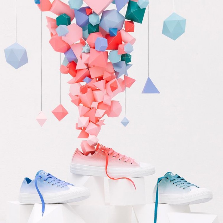
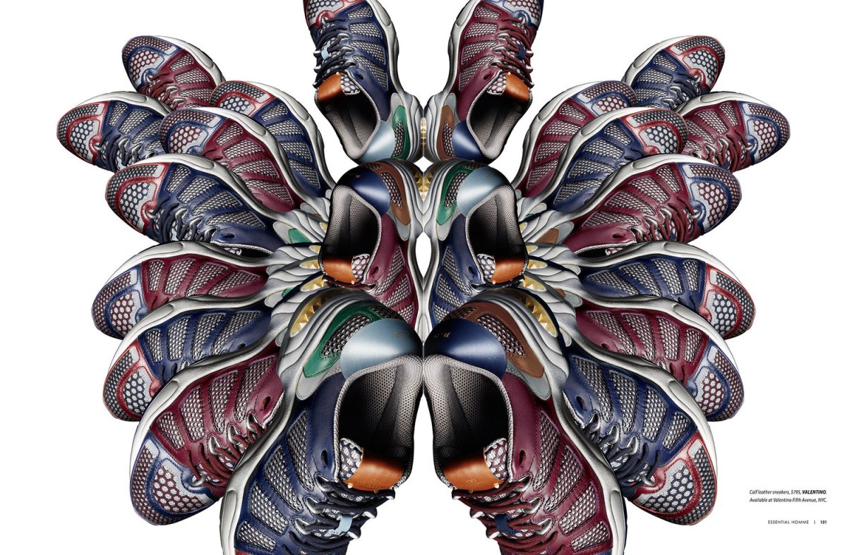
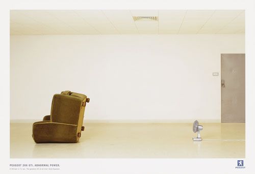
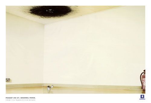
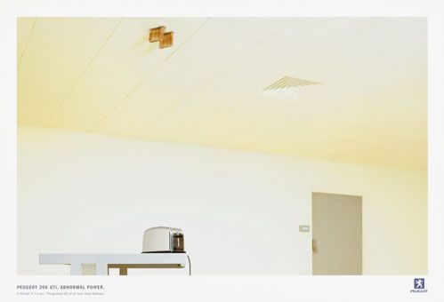
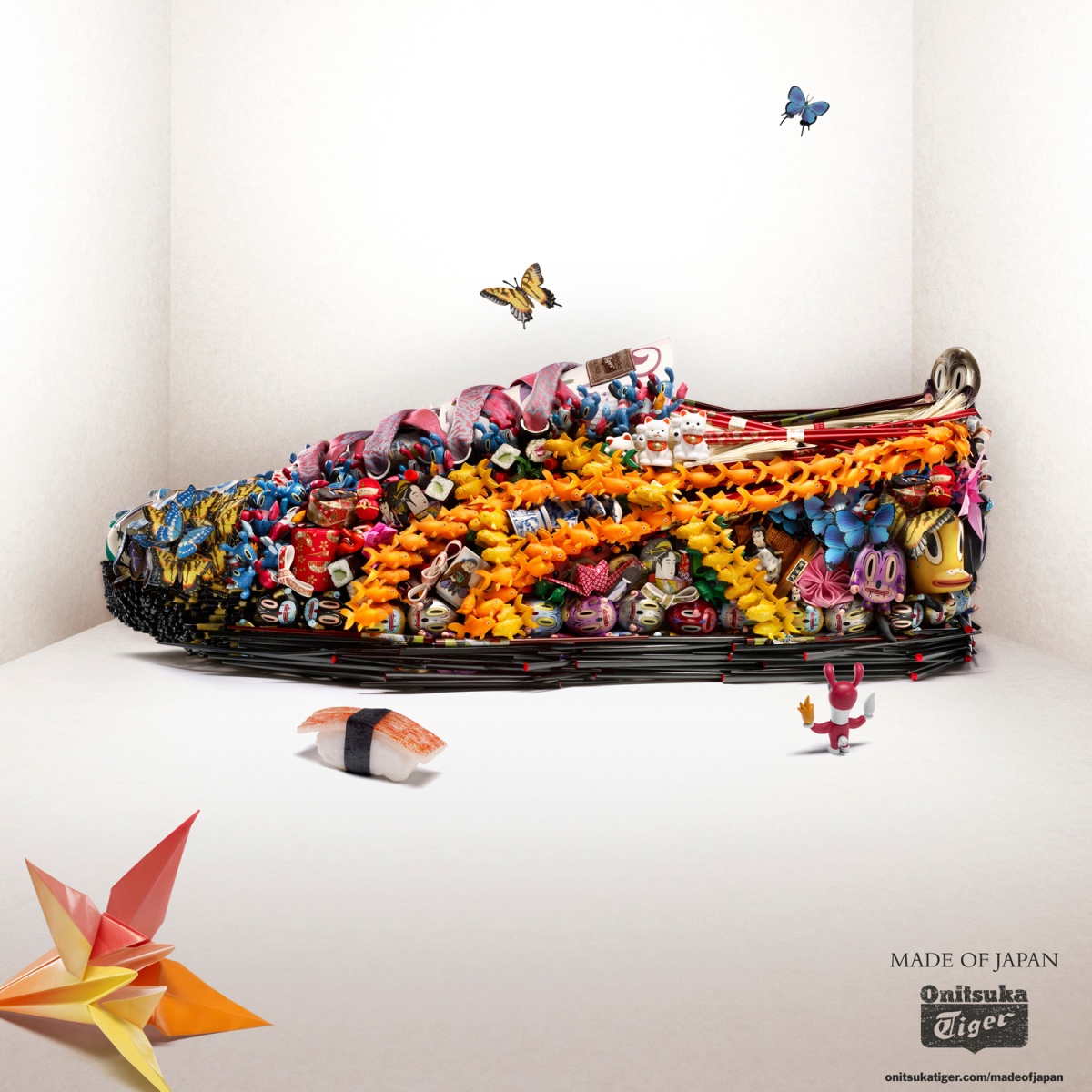
To me, this photo for Converse’s faded shoes illustrates the commercial message of how an explosion of colours and life can come about from owning a pair of those Converse shoes. The colours, shapes and forms from that graphical prop blends well with the product and gives the photo a very stylish look as well. While the prop may look domineering in terms of visual space, it does lead the eye down to the product being advertised. With the white background and landing platform for the shoes, it lends a clean and minimalistic element to the photo as well.
To view the full set of images for this campaign, you can visit this.
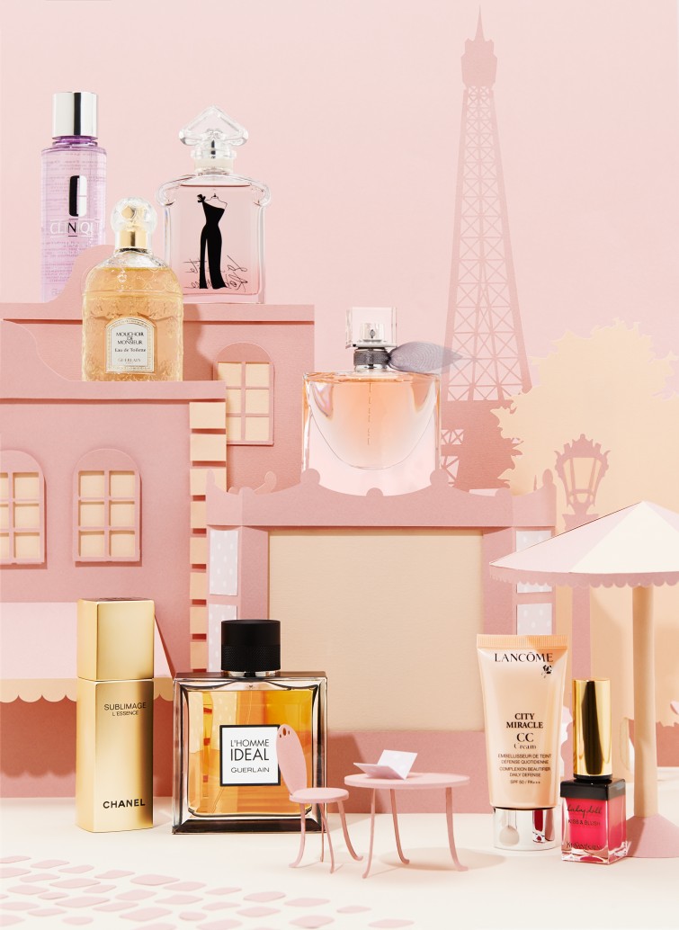
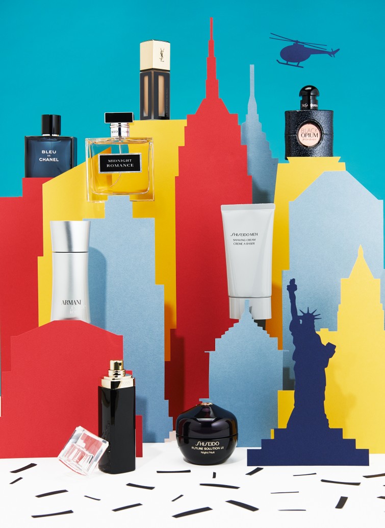
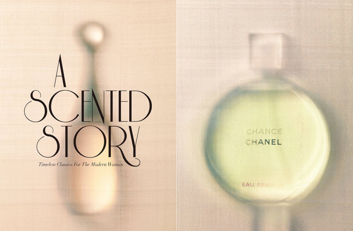
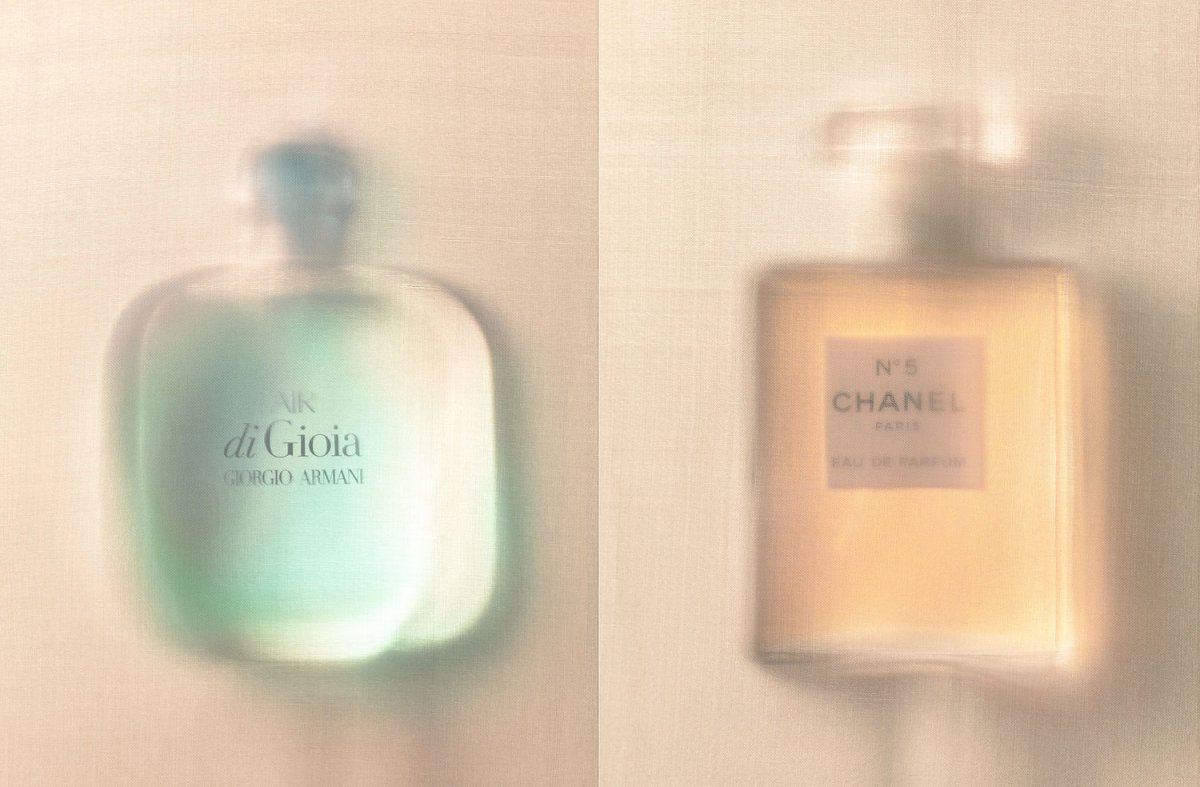
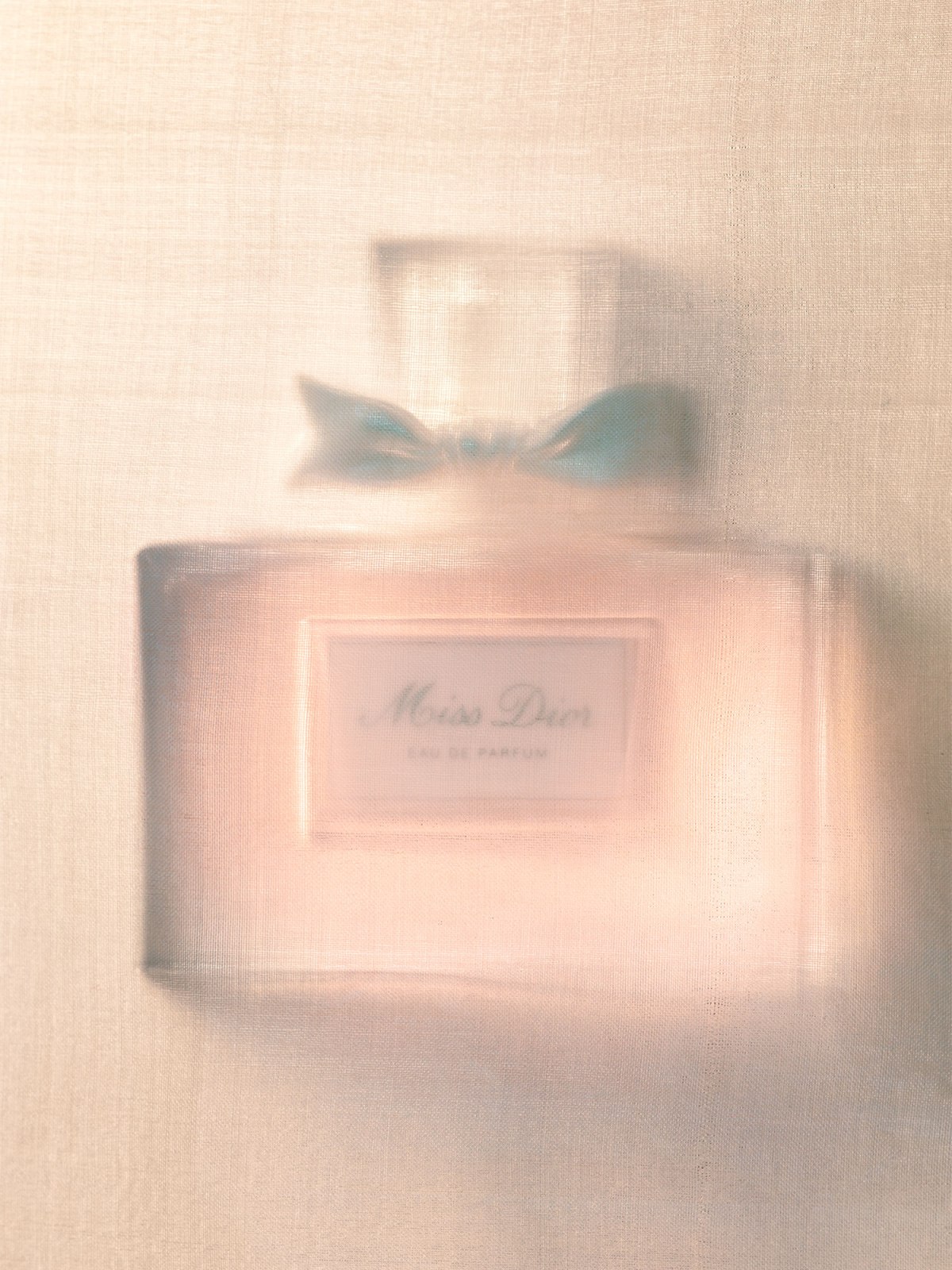
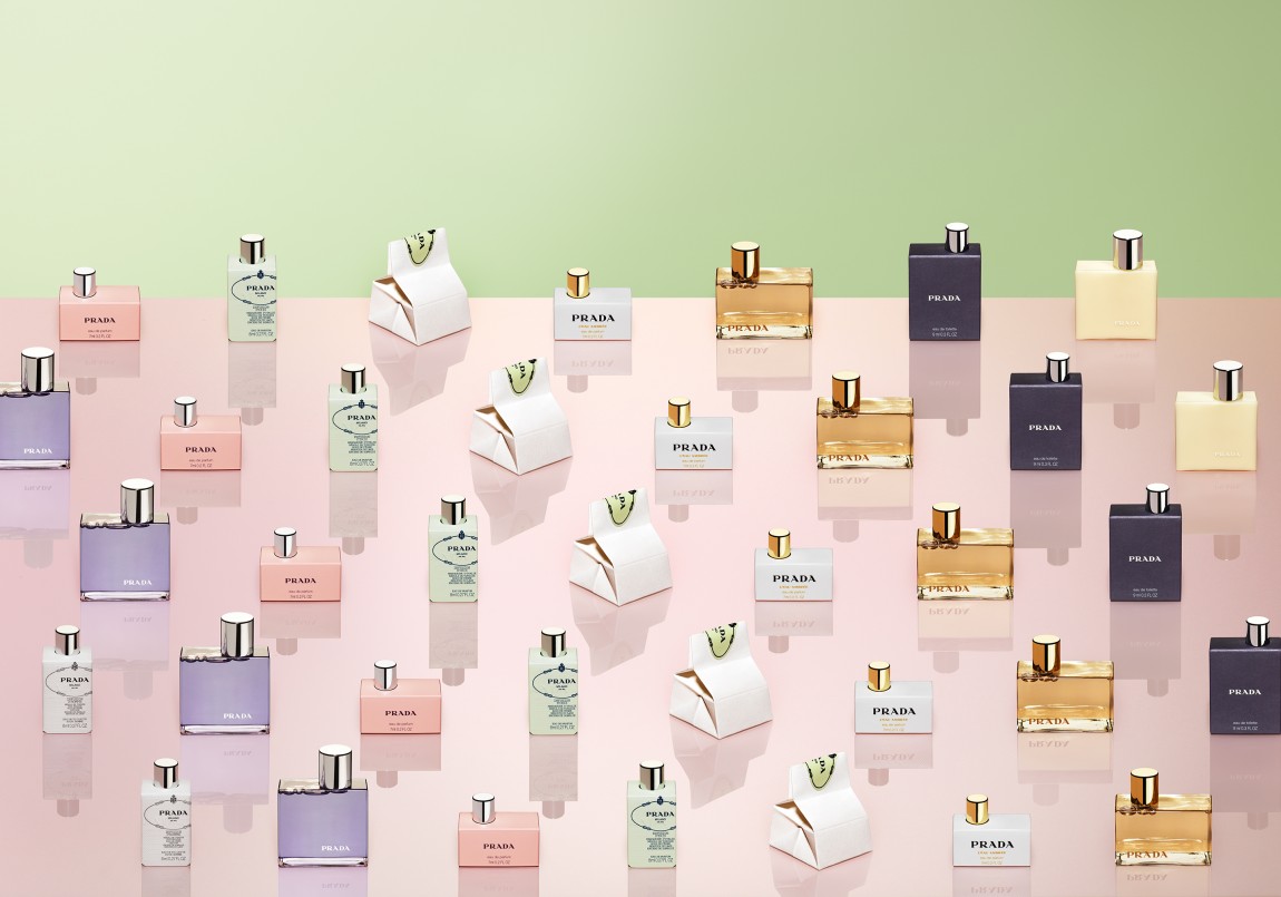
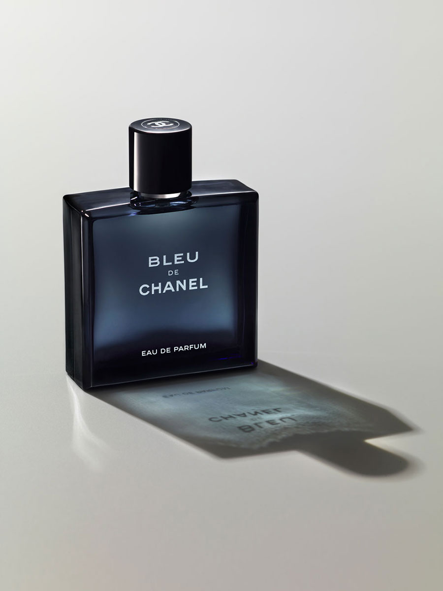
With the theme of Valentine dates, Adrian and Gidi showcased different brands of perfume placed in different cityscapes and floral settings to stimulate the sense of anticipation and excitement of romance. While the set designs are the first to attract attention, the way the products are placed are also eye-catching – the positioning of the perfume bottles on the building near the Eiffel Tower, angling the product among the paper trees, tilting the bottle’s cap against it. This makes the images more dynamic in mood and not so stiff, as it would if it were just products plainly put among the different props.
To view the full set of images for this campaign, you can visit this.

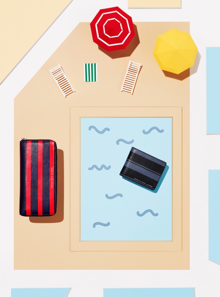
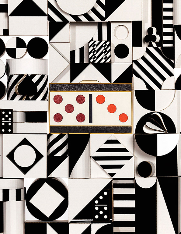
For this photo shoot for KaDeWe, Adrian & Gidi have shot it flat-down, as they did with the Clinique product shoot. The theme is evidently summer set in the cityscape, with the different departmental store products personified as urban dwellers having a fun time with summer activities. Their whimsical style shines through in their art direction, letting the camera ‘take off its clothes’ to sunbathe, the ‘mummy’ wallet overseeing her ‘child’ wallet swim in the pool, the ‘crocodile’ shirts swimming in the lake. This series most certainly gives a different perspective to the everyday products we use, as if imbuing them with their individual personality.
To view the full set of images for this campaign, you can visit this.
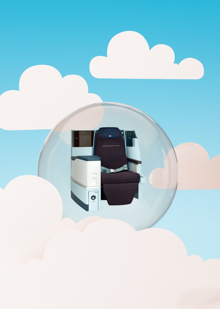


Again, Adrian and Gidi made use of different analogies and imageries to advertise KLM as the airline with all the comforts and adventures you can find. Using plastic bubbles, beds and a rollercoaster track, they have created an branded image of KLM as fun, soothing and secure. I really admire how they have utilised only a few simply props to create a photo series that is playful yet effective in getting its commercial message across.
To view the full set of images for this campaign, you can visit this.
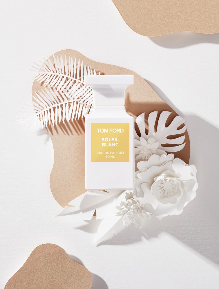
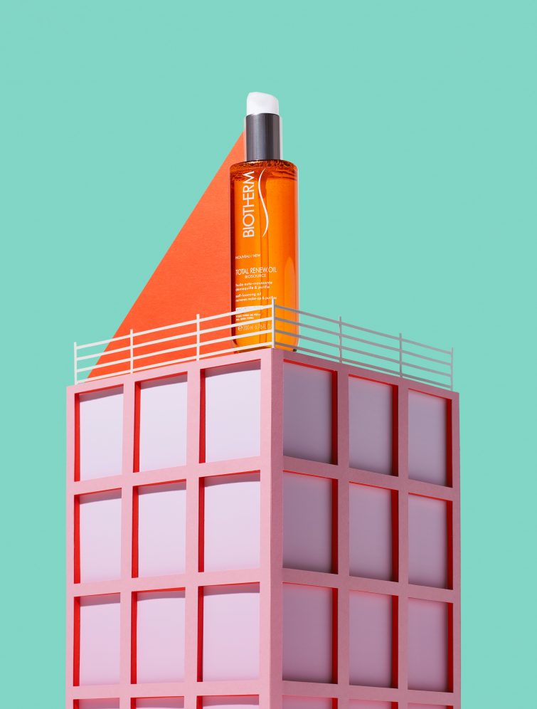
Shooting these design sets for Stylist magazine, Adrian & Gidi let the colour tones of the product lead on the shapes and colours of the prop sets. The bottles are highly stylised with the handcrafted props and give off, respectively, tropical sunny and very modern cosmopolitan vibes in their visuals. I like the shadow detailing in the first image, as if you really were in a tropical island with the sun-cast shadowns around. As for the second image, the cosmetic bottle is seen as if towering over the city blocks, giving protection with its ‘triangular’ renewal oil. These refreshing takes on products still-life photography give the images more of a storytelling background, which only draws more people in closer to engage with the visuals.
To view the full set of images for this campaign, you can visit this.
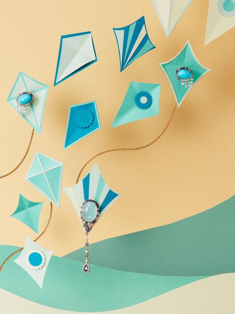
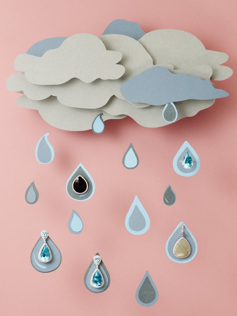
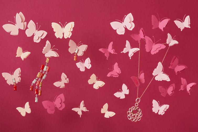
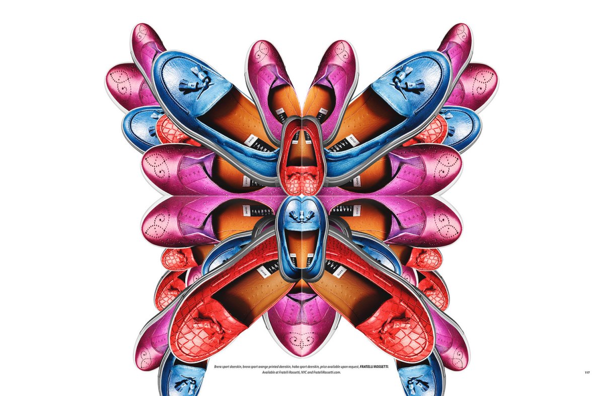
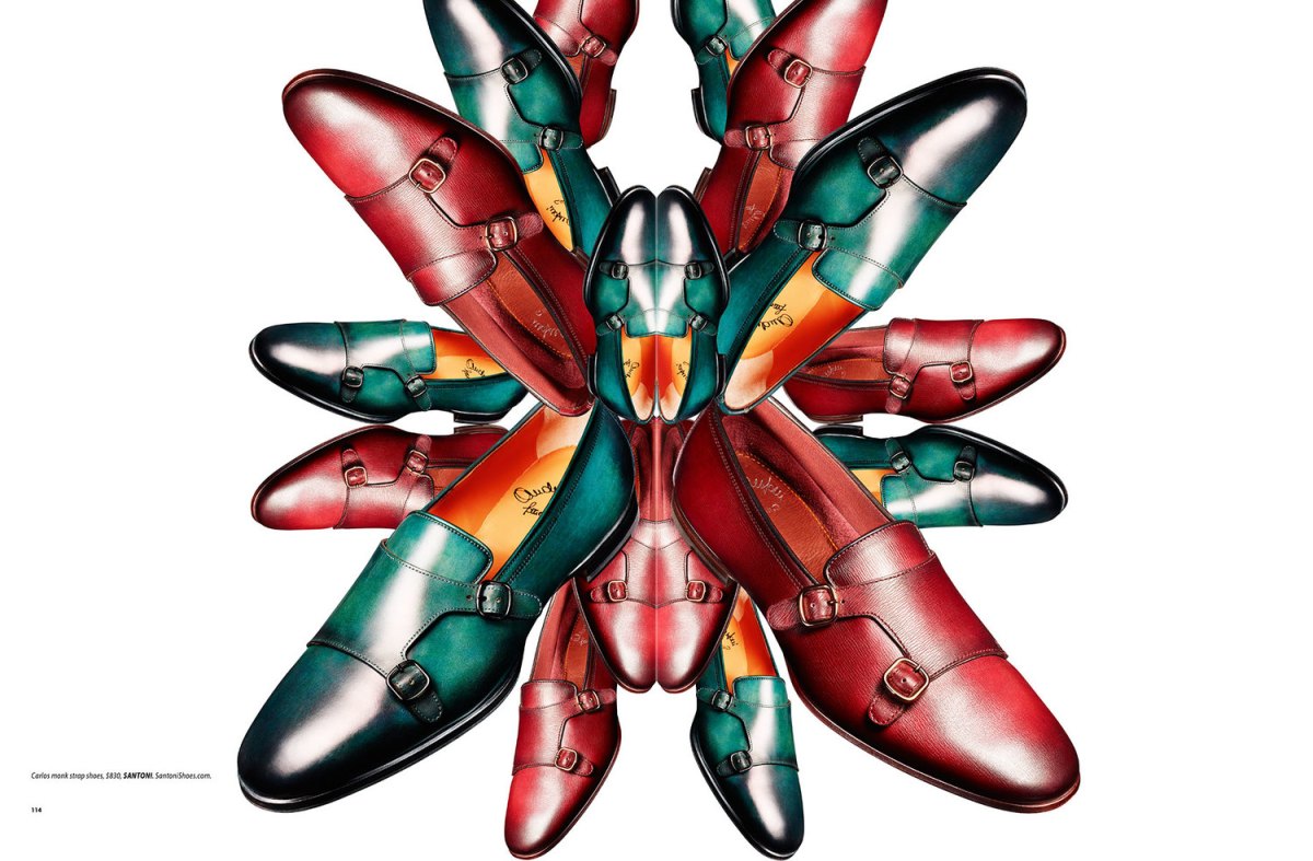
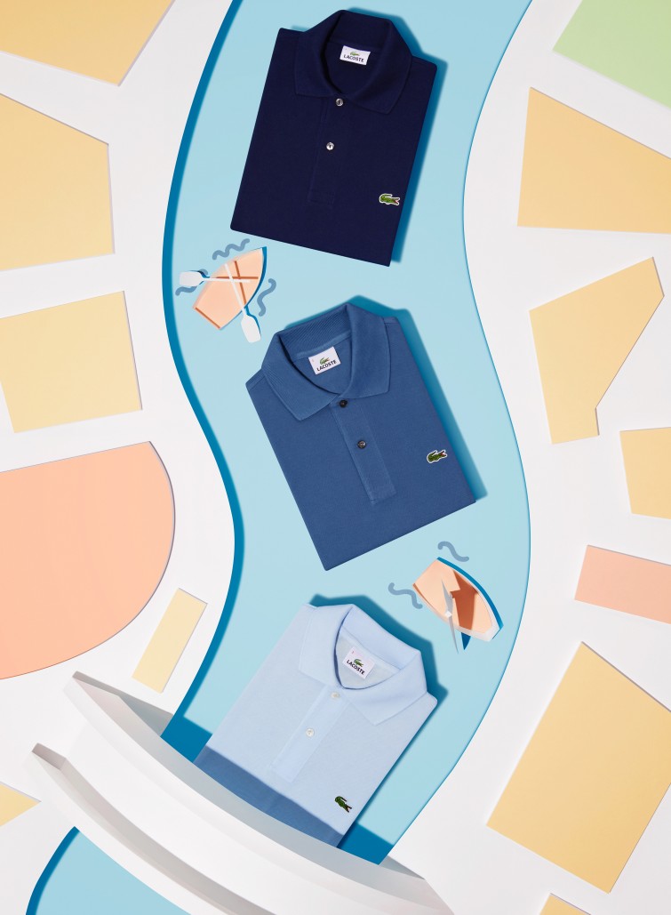
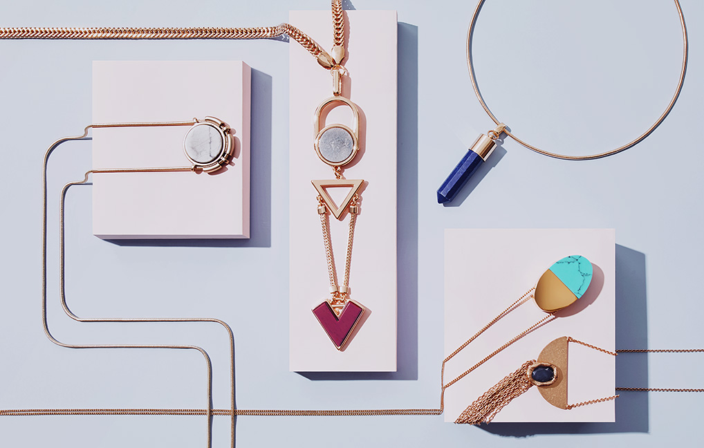
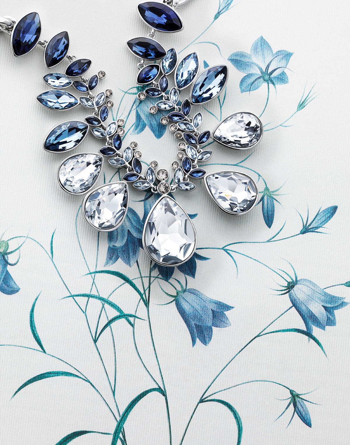
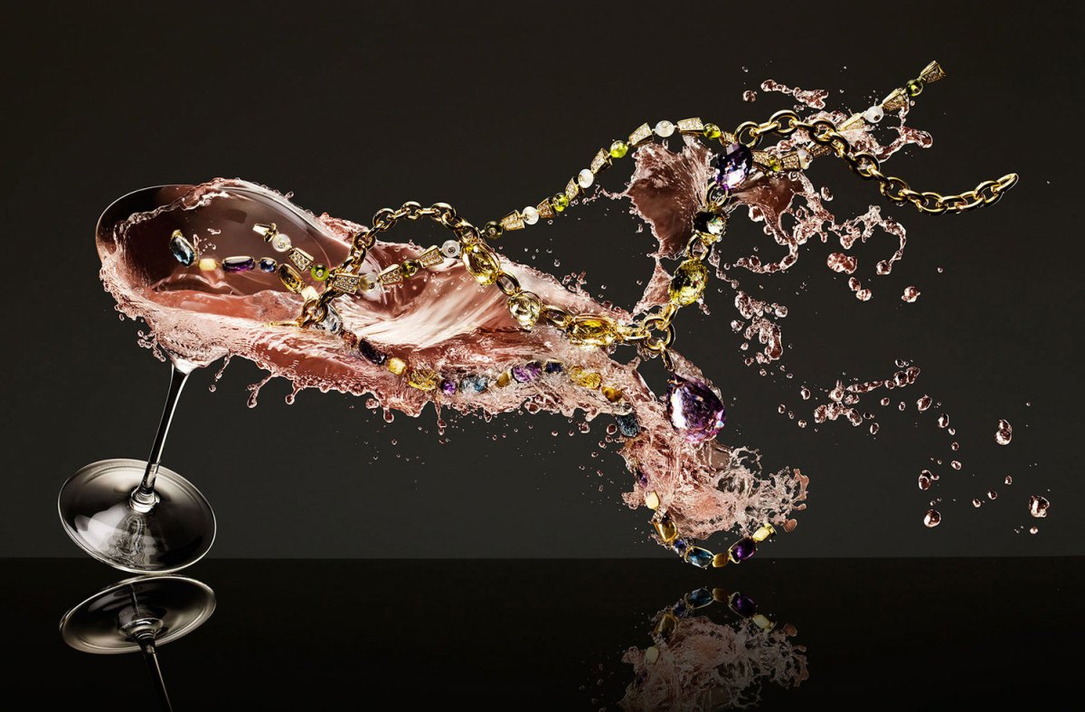
Photographing these jewellery for Vogue Gioiello, Adrian & Gidi took on the theme of “It’s in the air”. Using prop sets like the clouds and raindrops, kites and butterflies, the products are placed as if they are part of the design sets now. The colour aesthetics of the series goes well with the products’ colour tones and there is always an element of motion within all the images, as it should be with air and movement.
To view the full set of images for this campaign, you can visit this.
All images copyright of Adrian & Gidi.
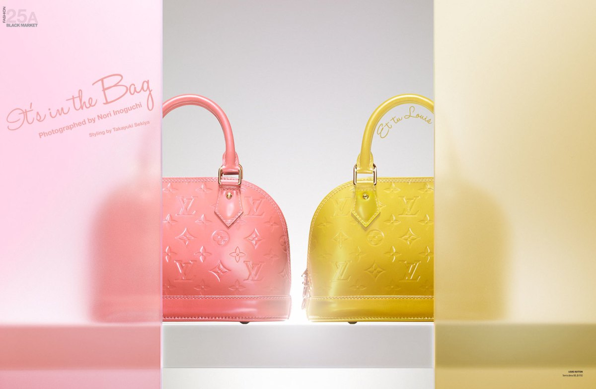
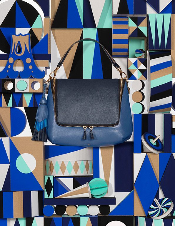
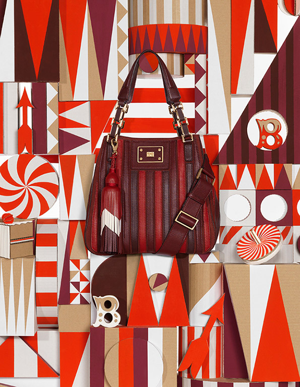
 This editorial campaign places luxury bags behind frosted screens, as if they are being slowly being revealed on stage to the viewer. The matching colours of the bags and the frosted screens adds harmony and symmetry to the visual, while the luxury bags take on the personalities as hinted at by their respective taglines.
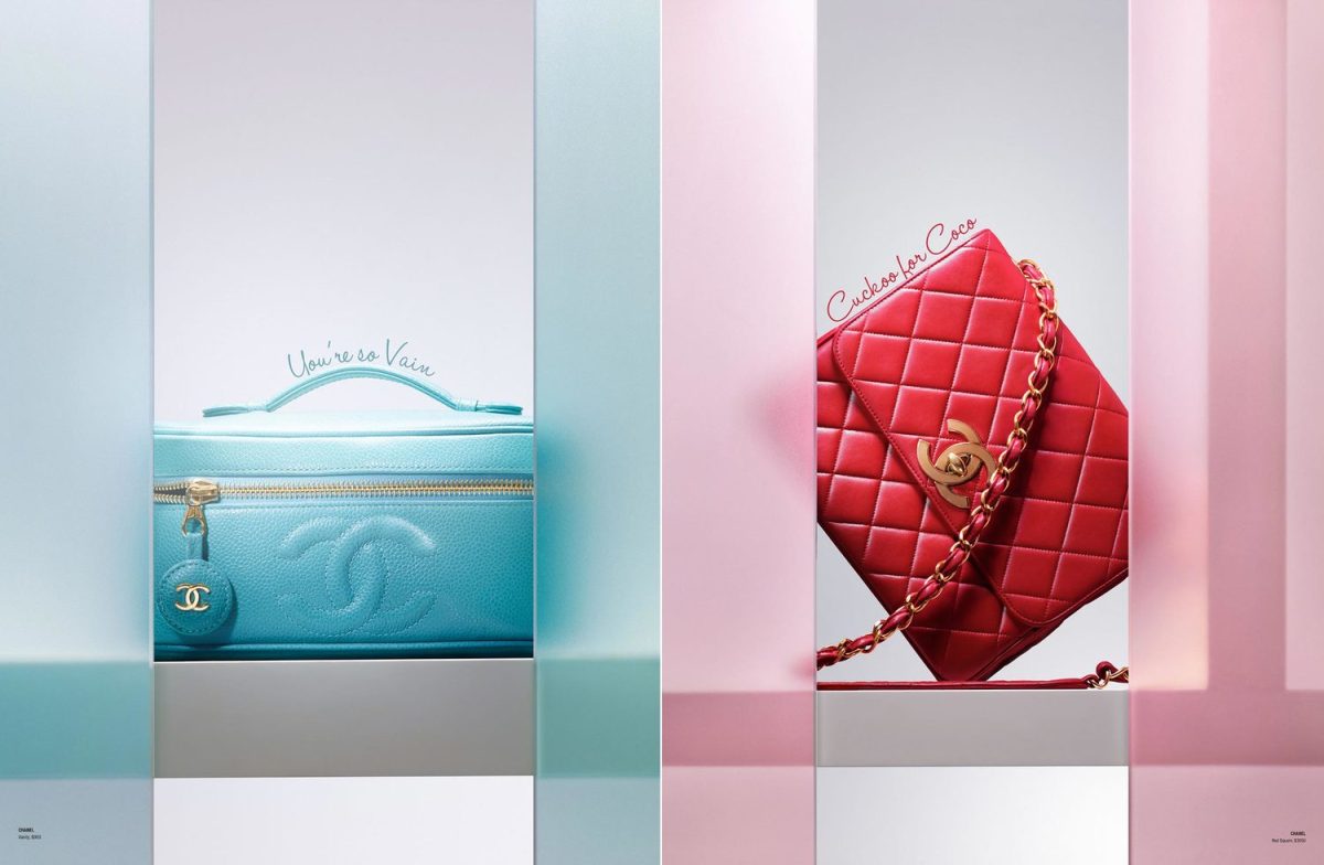
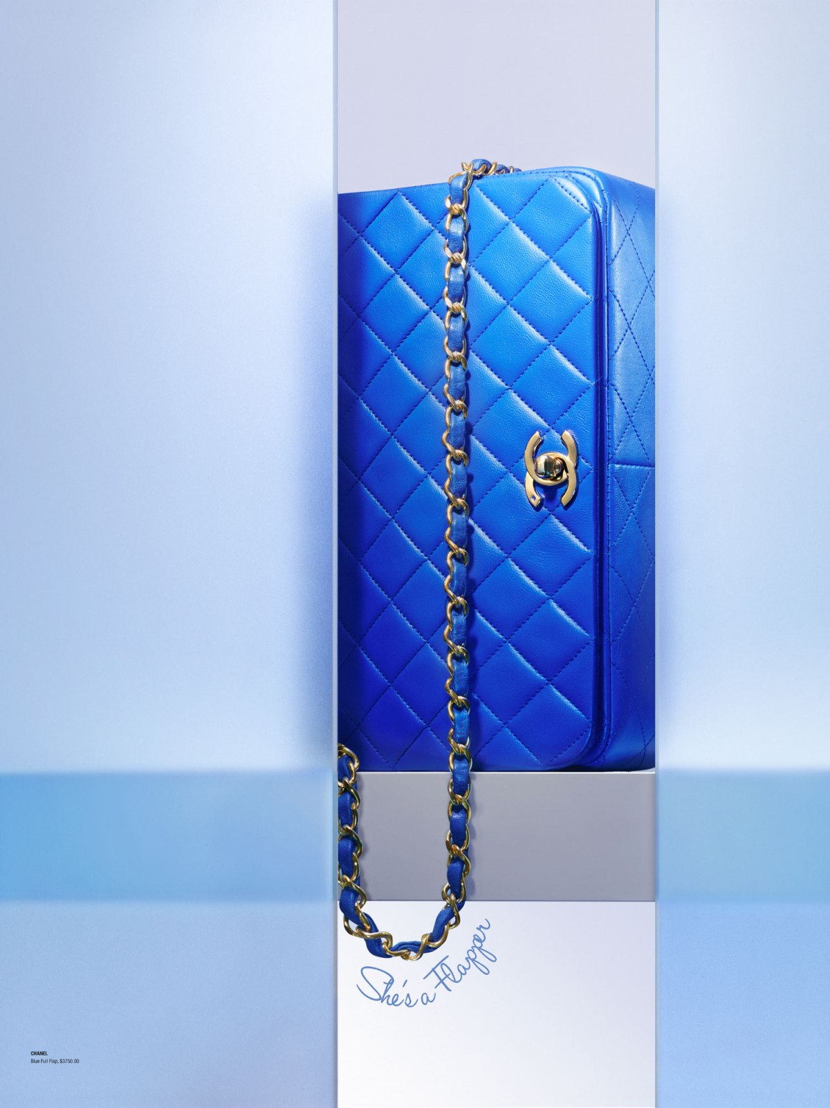