Jenny Van Sommers is a London-based photographer who does still-life and editorial photography work. Originally from Sydney, Australia, Van Sommers had previously failed in art school there before making waves in London’s photography scene. Her photographic style is very distinct in its graphic lines and art direction, which combines with a strong sense of quirkiness in her storytelling.
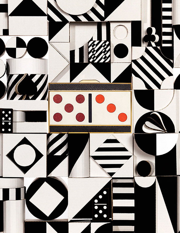
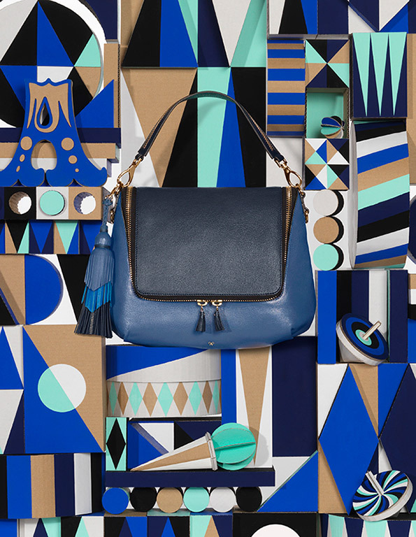
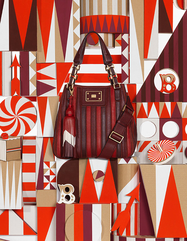
In this campaign for Anya Hindmarch, Van Sommers worked together with a set designer, Rachel Thomas, to create this extremely mesmerizing graphic theme to go along with the bold line of handbags. Inspired by classic games like chess, dominoes and backgammon, the painted cardboards act as a refreshing backdrop for the handbags. Instead of relying on the cliche of female models posing together with the handbags, Van Sommers and Thomas have created a very unique perspective of how consumer handbags can be played around with.
To view the full set of images and more information on this campaign, you can visit this and this.
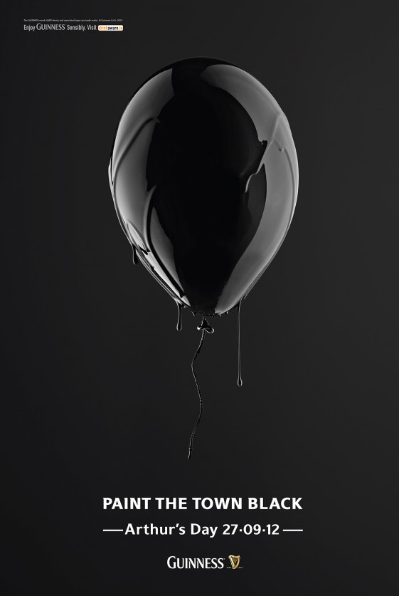
This does not look like an easy image to photograph, what with the black-on-black visual. But Van Sommers has made this image look slick, sexy and mysterious, all while cheekily getting the client’s message across. While the actual product (Guinness beer) is not shown, the branded colour, black, is strongly emphasised and imprinted in the visual senses. With a clever tagline and a familiar symbol for parties, Van Sommers’ simplistic yet elegant photographic style is much to be admired. Technically, I am also in awe in how the black paint’s curves are defined so smoothly on the balloon.
To view the full set of images for this campaign, you can visit this.
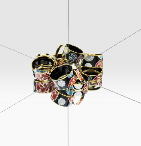
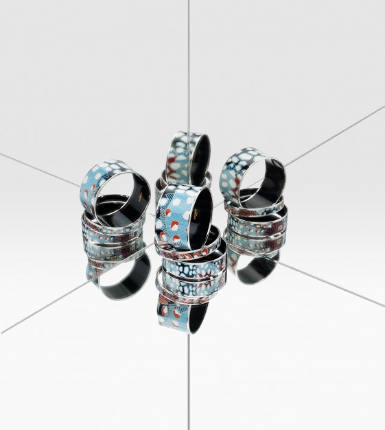
For Hermes, Van Sommers is serious in her play with perspectives when presenting these rings. Dazzling yet confusing, perplexing yet insightful, these images show a very different side to these colourful rings, as if they are leading multiple lives with their mirror images. The composition is easy enough to set up, but it take a practised creative eye to recognise the possibilities of this (haha) eye-catching visual. The lines from the mirrored surfaces also add a surreal dimension to this photo, making you wonder which is exactly the real still-life object.
To view the full set of images for this campaign, you can visit this.
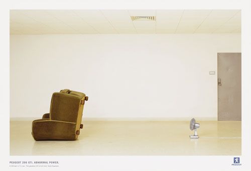
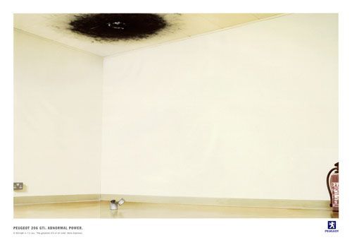
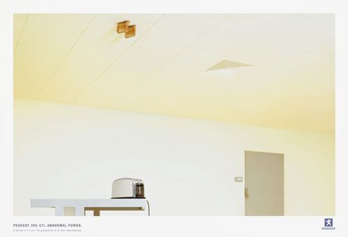
Once again, Van Sommers chooses not to show the actual product advertised, but uses other objects and props to get her point across simply. I love the creative art direction in this series and the sense of humour in her visual communication style. Her clean and minimalistic style provides much focus on the two main objects, e.g. the fan and the couch, the lighter and the burnt ceiling, the toaster and the bread in the ceiling. These images all tell a story that is strong in its creativity and imagination, making a powerful message for Peugeot.
To view the full set of images for this campaign, you can visit this.
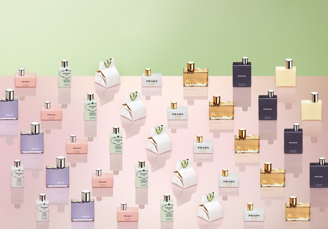
What attracted me to this still-life image is the pastel colour palette and the strong lines and patterns from the lined-up perfume bottles. Using repetitive forms of the perfume bottles, Van Sommers has produced an aesthetic that is rather whimsical and graphical at the same time. The colours of the perfume bottles are also arranged in a very pleasing tone, mixing well the warm and cool colours. The lighting also lends well to producing reflections of each perfume bottle, giving a sense of symmetry to the image.
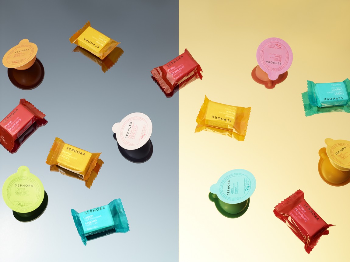
At first glance, you may think that Van Sommers is photographing candy sweets, when they are actually cosmetic products from Sephora. The candy colours and sweet-like packaging definitely appeals to the visual senses and it also adds a layer to the story Van Sommers is conveying – that these products can be played around with, just like the sweets of yesteryear in your childhood. In this case, she is letting the product itself (form, colour, packaging, etc.) work towards getting her visual message across to the viewer.
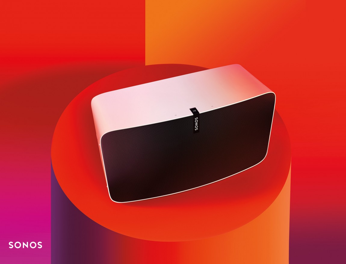
With colours reminiscent of the 70s’ groove and funk, Van Sommers is letting forms and lines take centrestage in these images. There is a great emphasis on graphical shapes and lines, which complement the product’s similar curves and textures. The bold lighting acts as a big contrast to the product’s plain black and white range and this opposition creates an interesting edge to the visual.
To view the full set of images for this campaign, you can visit this.
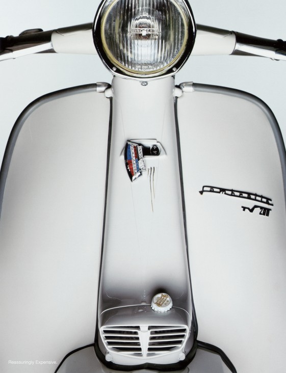
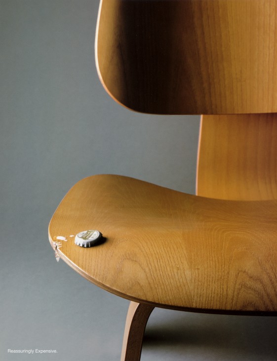
Van Sommers uses this simple idea of just using a beer’s bottle cap as the main focus of her storytelling and her execution is really quite brilliant. Together with a sharp tagline, the branding of the product as luxurious and expensive is also achieved. With this set of images, they may appear deceptively simple but once you look closer, the real truth is revealed. And I think that is one of the greatest strengths of Van Sommer’s still-life photos, making the audience always doing a double take and rethinking how they view through their own lenses.
To view the full set of images for this campaign, you can visit this.
All images copyright of Jenny Van Sommers.
